Designing a closer look at your day
We spent more time on Carom's day view than any other view in the product. It's the first thing you see when you open a Space, and the first thing you check in the morning. It needs to feel right.
We started, as we usually do, by writing down our requirements, our constraints, and the things we knew we'd be wrong about. You always have those.
Requirements
It's always helpful to define our requirements, constraints, and guiding assumptions up front:
- We need to see enough of the day to get a sense of how busy we are, while still providing meaningful information about each appointment.
- Each event needs to carry its weight: who's involved, when, and what's at stake — not just a colored block.
- The calendar has to fit comfortably alongside everything else in a Space, without dominating the screen.
- It has to work on every screen size, from 13" laptops to ultrawides.
That last one is the hardest. A day is a fixed thing — 24 hours, give or take — but screens aren't.
When you look at your calendar matters
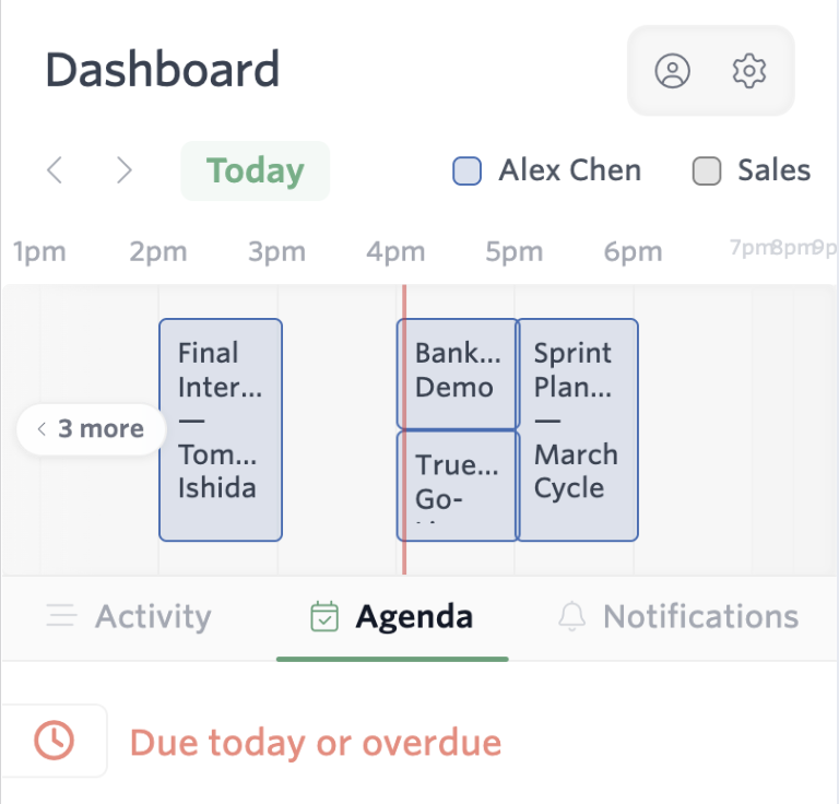
When you look at your calendar matters. If we can't show the whole day on your screen, we should focus on the part that matters: what's happening now and next, not what happened earlier.
By the end of your day, that means we'll center your calendar on your afternoon and evening events. In the morning, we'll focus on your early meetings — while still letting you know how much is to come later in the day.
The calendar isn't a snapshot of your day. It's a window onto the part you can still do something about.
Past meetings get a slim recap. Future meetings get the screen.
Not all days are the same
Some days start at 7am with a standup. Others start at 11am with a meeting that's actually a coffee. Some end at 4pm. Some end at 9pm with a dinner. We needed the same view to work for all of them.
We considered three approaches:
- Fixed hours. Show 8am–6pm, every day. Simple and predictable. But it cuts off your 7am standup and your 7pm dinner. Bad.
- Dynamic hours based on the day's events. Show only from the first meeting to the last. Better — but if you have one 9am call and one 5pm call and nothing between, you've got a screen full of nothing.
- Smart hours based on context. Compute a reasonable window around your events, then shift the focus based on the time of day. At 9am you see roughly 8am–2pm with a hint of what's coming. At 4pm you see roughly 2pm–8pm with a slim recap of where you've been.
We shipped option 3. It's the kind of thing nobody notices when it works. We're fine with that.
Density without clutter
Each event needs to carry its weight. We tested four levels of density inside individual event blocks:
- Block-only. Just a colored bar showing duration. Reads quickly. Says nothing.
- Title-only. Adds the event title. Useful, but anonymous.
- Title + attendees. Adds who's there. This is where it started to feel like a real tool.
- Title + attendees + prep status. Adds a small indicator on events with unresolved work attached from our Planner agent. Too much, in practice — the eye doesn't know where to land.
We ended up at level 3, with a single attention cue on events that have prep work waiting. Subtle enough to not nag; visible enough that you don't forget.
What we got wrong
Two things, mostly.
Fixed-height blocks. Our first cut showed events at the same height regardless of duration. A 15-minute "quick chat" took the same visual real estate as a 90-minute planning session. Within a week of internal use, every teammate said some version of the same thing: make the long ones bigger. We did.
Multi-day view as the next step. We thought we needed a week view next. We didn't. Once the day view shipped, requests for "week view" mostly went quiet — what people actually wanted was a really good today, plus a quick way to peek at tomorrow. We built that as a thin "tomorrow preview" tucked below the day, and most of our team uses it more than the proper week view we eventually shipped.
What's next
A short list of things we want to do better:
- Conflict rendering. Overlapping events stack today, but at deep nesting it gets messy. We want them to fan out more legibly.
- A distinct look for focus blocks. Deep-work time shouldn't blend in with calls.
- Smarter prep prompts. Less "you have a meeting in 5 minutes" and more "here's what came up in your last thread with this person — you'll probably want to skim it before."
If you've got opinions on any of this, we'd love to hear them. partner@carom.io.
— David